Nonfiction in the middle

Mediating between curiosity and research, curriculum and pleasure By Nadine Bailey and Katie Day

In the summer of 2024 we asked International School Middle School librarians to tell us the story of nonfiction in their libraries. We wanted to know their ambitions, frustrations, organisation and display as well as their collection development and usage plans. All books recommended in this article can be found tagged in our LibraryThing Shelf (https://www.librarything.com/catalog/middleNF). 

Curriculum and Research

Educators and librarians who have been around for a while know and recognise the pendulum of ideas and practice that upend things first in one direction and then another. Nonfiction is one of those things where some of the momentum is now moving back to the practice of reading subject matter in physical form. Many librarians responded that in a post-covid learning environment both they and the teachers they work with were moving back to giving information in print form – mainly books where they were available, but also printing out articles from online sites such as Britannica and Newsela in order to encourage deep reading, avoid distractions and teach nonfiction reading skills that could be later transferred to online reading. 

Schools following the IBO (International Baccalaureate Organisation) programmes (PYP/MYP) had particular interest in “transdisciplinary” and cross curricula books that would offer broader perspectives on curriculum or unit themes. Many librarians were investing in books that would support inquiry into aspects of the United Nations SDGs (Sustainable Development Goals). There was also a keen interest to ensure that sufficient “local” (country where the school is located) and “diverse” (countries of students’ origins) content was available in the library.

Many librarians have quite heavily weeded their nonfiction sections and are now looking to re-stock them based on this renewed interest in physical books. But it appears that publishers are not necessarily aware of what is happening on the ground and are not always updating and bringing out new editions of popular texts. 
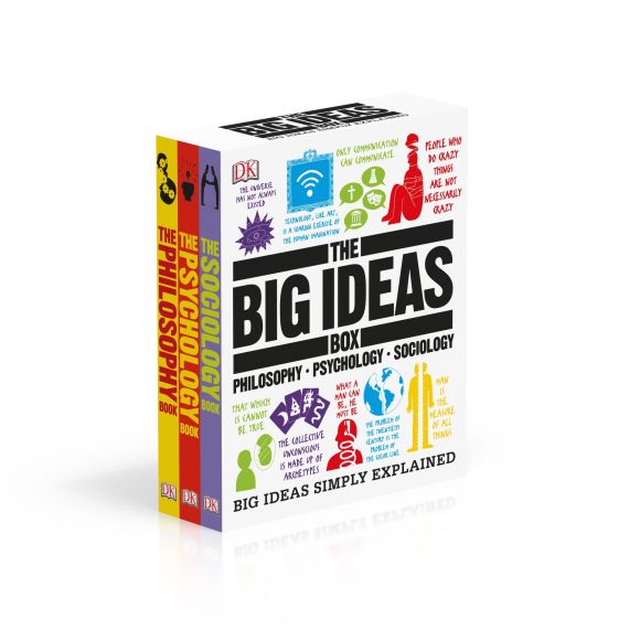
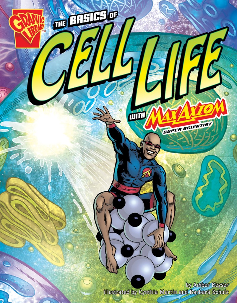
On the other hand, most respondents remarked on how much progress had been made in the last few years on the design, layout and illustrations in recent nonfiction texts. There was also a shoutout for the increase in different formats including “Oversize books” (see the books of “Big Picture Press – Welcome to the Museum”); Graphic and Manga imprints (series such HowToons; Cells at Work; and authors such as Don Brown and Jim Ottaviani); infographics (Infographic guides; ) Subject Summaries (The Big Fat Notebook series), Picture books (see this 2024 SLJ list) and Subject Overviews or introductions (DK Eyewitness, and DK Big Ideas).

Where curriculum and research is concerned, students can now often choose their favourite medium of access through a variety of formats.
Foster the flame of curiosity

Somewhere on the way to middle school, students amend their passions to fit in with their peers and ensure a sense of belonging. So out go the dinosaurs and big trucks to be replaced with their favourite sports personalities, music stars, books about their sports (soccer and basketball seem to be hits). Puberty hits this group hard and fast and strategic placement of sensitive materials can put paid to rumours and myths. It is also a time of self-absorption and worry about their physical and mental health – books on health and well being, relaxation, anxiety, meditation as well as psychology, are popular and an area of growth in most libraries. 

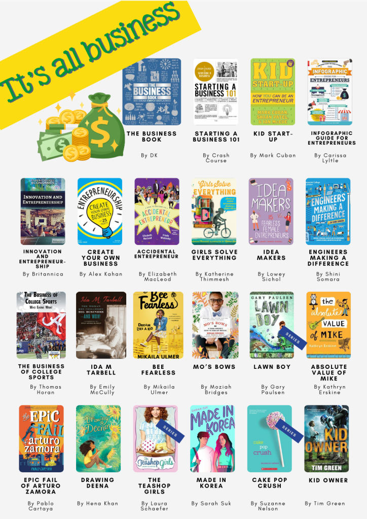
Given the demographics of our schools, students of this age are already taking a keen interest in finance, aspects of wealth and investment as well as entrepreneurship. They’re also interested in personally exploring hobbies and activities they may see online such as cooking, sewing and knitting or other crafts. 
History – particularly the world wars and more recent conflicts continue to fascinate and appal in equal measure – often mediated by historical fiction texts students may encounter in their literature studies or English classrooms and what they see on the news or social media. 

Shelving, organisation and display

In order to make nonfiction appealing and accessible, quite a few of our respondents mentioned they either had or were in the process of rethinking the way that nonfiction was shelved, organised and displayed in their libraries. There is a continuum from pure DDC (Dewey Decimal Classification) to a range of Book Shop or genrified models. Librarians were more interested in getting books seen and read than in a hypothetical need for their audience to be able to navigate a university library later. One of our respondents coined the lovely phrase of “emotional accessibility” in this respect. 

Of course most libraries have already taken the first step of putting “literature” or novels out of a straight Dewey 800 section into a fiction collection – genrified or or not. Other common “extractions” from the main Dewey structure include:

  • Taking Biographies, collective biographies and memoirs out of 910/920 and putting them in a separate section. Some libraries put collective biographies at the start of the section they pertain to (i.e. famous musicians go to 780).
  • Travel Books
  • Poetry
  • Drama and playscripts
  • Graphic Novels and Manga 
  • Narrative nonfiction
  • Myths, Legends and Fairytales
  • Parenting 
  • Well Being
  • Professional Development 
  • Sports 
  • Country specific collections
  • A specific nonfiction series that’s popular
Photo: American School of Dubai MSHS Sport Section

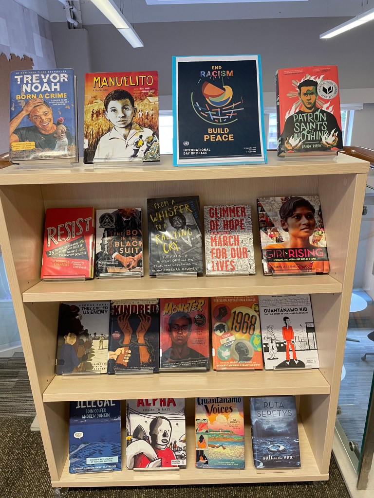
In the absence of permanently pulling out a section – many librarians make use of rotating “dynamic shelving” or temporary topical displays. The guideline here appears to be to follow the needs and interests of the community – teenagers want to be able to independently navigate the library without adult intervention that may be embarrassing. 

Related to that – signage and signposting was an area that nearly all librarians were investing in. Many mentioned significant weeding that had resulted in more space for forward facing displays and carving out sections of interest. 

Recommendations

To support the discovery of nonfiction titles for middle school, we’ve curated a shelf of 389 (and growing) books on Librarything that we consider to be worth investing in. It’s an ongoing labour of love, so not every book has been tagged at this point yet.

Examples of Some of the tagging we’ve employed are (not an exhaustive list):

  • Narrative nonfiction
  • Manga
  • Graphic
  • Topic_
    • WW2
    • Women
    • Science
    • Mathematics
    • Religion
    • History
    • Climate
    • SDGxx
    • Activism
    • Wellbeing
    • War
    • Technology
    • Sustainability
    • Sports
    • Space
    • Social Media
  • Geo_
    • Southeast Asia
    • China
    • USA
    • Europe
    • UK
    • Australia
  • Edition
    • Young Reader

Since such lists can quickly go out of date, we’d also like to generalise with some series, authors, titles and publishers that we recommend.

Great AUTHORS 

  • Marc Aronson
  • Don Brown
  • Marc Favreau
  • Candace Fleming
  • ​​Russell Freedman
  • Yuval Noah Harari
  • Deborah Hopkinson
  • Tanya Lloyd Kyi (Canadian)
  • Randall Munroe
  • Jim Ottaviani
  • Elizabeth Partridge
  • Gillian Richardson
  • Steve Sheinkin
  • Cory Silverberg (Puberty)
  • Dashka Slater
  • Tanya Lee Stone
  • Pamela S. Turner

Great PUBLISHERS

  • Annick Press (Canada)
  • DK (Eyewitness; Big Ideas; Children’s Timelines; How Things Work; How Stuff Works)
  • First Second (MacMillan)
  • National Geographic for Kids
  • Usborne (UK)
  • Crabtree Publishing Company
  • Flying Eye Books

Great SERIES

  • DK Eyewitness
  • DK Big Ideas
  • DK Children’s Timelines
  • DK How Things Work / How Stuff Works
  • From Playground to Pitch
  • HowToons
  • Hazardous Tales (Nathan Hale)
  • Little Histories 
  • World Citizen Comics
  • UN sustainable development goals

Great TITLES

There’s been a recent shift toward publishing a Young Adult version of popular nonfiction titles either simultaneously or shortly after the Adult version. These can be found by searching for “Young Readers” or “Young Reader’s edition” / “Young Reader’s Adaptation”.

Blogs and nonfiction websites

Nonfiction Book Awards

Pairing Nonfiction and Fiction

Last but not least, pairing a nonfiction book with a novel can enhance both texts.

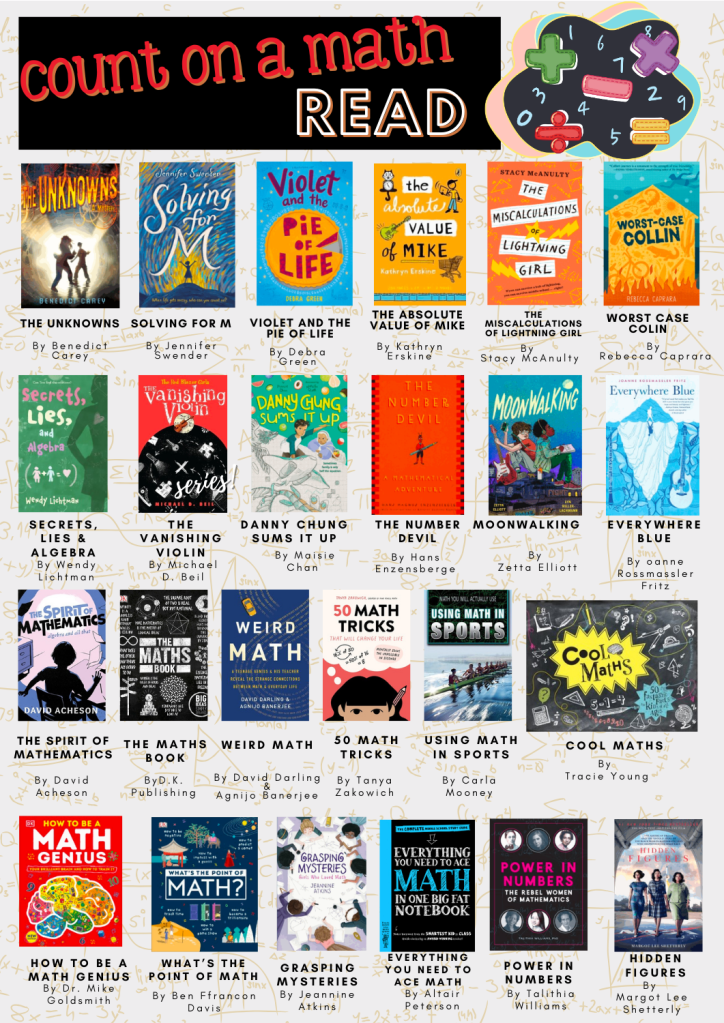
I initially started putting a fiction book on this libguide followed by suggestions of nonfiction, https://asdubai.libguides.com/ms/reading/nonfiction. I’ve now moved away from that somewhat and have started curating “Read Around the Curriculum” posters where either a curriculum topic is highlighted with fiction and nonfiction, or an “If you like / want to know more” poster is made of one of our book club fiction books with suggestions for finding out more about the context with other fiction/nonfiction books on the topic.

Katie Day and I would love to hear your suggestions for more nonfiction books, and perhaps we can expand the list to High School. Many of the books suggested in our list are suitable for High School and upper elementary as well.

Comments and suggestions much appreciated.

NOTE: Since the publication of this post we have been approached by commercial entities about using the list. While we cannot prevent the list from being used commercially this is our wish:

This list was created in order to freely help librarians all around the world. It was a labour of love which took a lot of our personal vacation time to create. If you are part of a commercial organization and you will be using the list commercially we would request that you attribute us and make a suitable donation in our names to “Biblioteca di Lampedusa” which serves refugees from around the world in their Silent Book initiative, https://www.facebook.com/BiblioLampedusa/ or the “IBBY Children in Crisis Fund”: https://www.ibby.org/awards-activities/ibby-children-in-crisis-fund.
Thanks. Nadine & Katie

Seek and Find – breakout

In the interests of trying new things myself, and also making library orientation and searching the catalog / tracing items from the catalog to the physical copy more fun, I decided to create a library breakout.

I’d watched the “Breakout” phenomenon ebb and flow about 3-4 years ago and had always put it in the “fun, but how?” box, and this year finally decided to get into action. Our HS Edtech person had purchased the official “Breakout box” so I could have a look at that and the resources in the official site, and our ES Edtech person had deconstructed the idea and had a bunch of Stanley boxes, suitcases with locks and locks, so I had a lot to play around with. The first port of call was the official Breakout Site. Like all great ideas, this seems to be one that had its hey-day around 2015 and many of the potentially interesting links to library orientation were either broken, or the video instruction didn’t work or there were other issues, so, I left, muttering “maintenance” . I found a few good breakout description online (Library Media TechTalk; The Bright Ideas Library; LibraryStew; Ms. Kochel’s book blog;) and then, after getting an idea of how it could work, sat down and thought of what my aims would be.

  1. I wanted to highlight the “Panda” books – the annual students’ choice books that are on a huge display in the library but often get overlooked by students and teachers alike – we order 5/6 copies of each book each year and students vote on their favourite in March.
  2. I wanted students to be familiar with the library guides and bookmark the front page.
  3. I wanted to make sure students could log onto the library catalog, search for a book and then find the physical copy in the library
  4. I wanted each student to know how to use the “self-checkout” station
  5. I wanted the students to search the catalog to find more obscure items (in titles, in descriptions of books, number of books in a series etc)

With my “ISTE educator” hat on, I wanted to ensure I could work on the role of “Facilitator”:

Educators facilitate learning with technology to support student achievement of the 2016 ISTE Standards for Students. Educators:
a. Foster a culture where students take ownership of their learning goals and outcomes in both independent and group settings.
b. Manage the use of technology and student learning strategies in digital platforms, virtual environments, hands-on makerspaces or in the field.
c. Create learning opportunities that challenge students to use a design process and computational thinking to innovate and solve problems.

In this case they would be “Knowledge constructors”

3. Knowledge Constructor
Students critically curate a variety of resources using digital tools to construct knowledge, produce creative artifacts and make meaningful learning experiences for themselves and others. Students:
a. plan and employ effective research strategies to locate information and other resources for their intellectual or creative pursuits.

ATLS (approaches to learning):

  • Thinking – Creative thinking / problem solving
  • Self Management – Affective – show resilience; Demonstrate persistence and perseverance
  • Social – Collaborative – share responsibility and roles with others

Universal design for learning:

  • Multiple means of Engagement: Provide options for Sustaining Effort & Persistence
  • Multiple means of Action and Expression: Provide options for Physical Action

The guide for the breakout can be found here with the clues. Students could access this guide through a QR code on the box.  Most of them didn’t examine the box for the QR code but went straight for the printed instructions.

The activity needed at least 50-60 minutes – with some classes we had that, and generally those were the more successful classes who managed to complete all locks.

Some teams / classes didn’t complete for various reasons, and they didn’t get anything. Nothing. No compensatory prizes, no consolation prizes. The teams who did succeed could trade in their “key for success” cards in the box for boxes of “smarties” or chocolates – and the feeling of success.

Main takeaways:

  •  Students need to be carefully guided to read the instructions completely and carefully
  • Their enthusiasm and “let’s run here” inclinations needs to be tempered with “hey guys, how about stopping and thinking about …”
  • Where an activity led them to need to get a next clue from the library staff, our staff was instructed that they only proceeded if they were politely addressed and asked (part of the hidden agenda that my staff are people with feelings who need to be treated respectfully)
  • Students (and teachers) often don’t see displays and look over them – their attention needs to be brought to things deliberately
  • Don’t assume anything – some 14 year olds have never done puzzles or have any idea of what a cipher wheel is!


Are nonfiction books still relevant?

I was showing a fellow librarian around “my” new library today and we were chatting and discussing various aspects of middle school librarianship. We got to the nonfiction section and both sighed. I started that mine probably needed some significant weeding and that I’d made a start. I pointed out a few particularly nice books in the collection (Annick Press still does nonfiction well, the newish Theodore Gray Molecules and Reactions). But so much ages so badly and so quickly. And in an inquiry based system where one wants to encourage systems thinking and embrace the idea of interconnectivity it is almost anachronistic to maintain Dewey divisions and populate them with single topic books.

Gone are the days when teachers gave the librarian a content based topic and you could wheel a collection of books that covered the length and breadth of what there was to know at a specific grade level about that topic. Done and dusted. Now you’re not so much discussing WW1, so much as conflict, with WW1 as the bare-bones scaffold of the topic. There aren’t that many books that deal well with the nuances of conflict in an age appropriate, stimulating but accurate, culturally sensitive manner. One such book is Global Conflict, from the Children in our World series by Louise Spilsbury.  No, it probably isn’t written with 14 year olds in mind. And I had to offer it somewhat apologetically to one of the teachers and say I thought it actually covered the ground fairly well, and everything else on offer was probably pitched at a much too high level.

Besides which, students aren’t reading books anymore. The books I pulled out on WW1 for a display remained unread, un-borrowed. I dare not investigate too closely where they got their information for their assessment from, since, looking at the database statistics it wasn’t from databases either.

A month or so ago, I had a look at our “country” books – they ranged from 1999-2005. A lot has happened since 2005. So they had to go. But what to replace them with – if anything? I checked the curriculum, spoke to the lead of the one grade doing something on national cultures and offered a collection I’d made in Epic! that could cover it more or less. There are no students pouring over country books or atlases like perhaps we would have done. If they need information there’s wikipedia or facts on file.

All this time I’m reading “Reader Come Home” (it sure is taking a long time, but I’m distracted myself) and the issue of shallow reading and attention and focus and digital media. And I wouldn’t worry if it weren’t for the fact that the problem doesn’t seem to just be shallow reading, it seems to be a great divide between reading a lot, and not reading at all. I ran some statistics last night. Our top (G6) class read 4x as much as our bottom (G8) class (at least books from the library – to which everyone says “oh but they may be reading books at home – to which I say “evidence?”). But that’s not the problem – looking through numbers student by student so so many hadn’t borrowed even one book. I’m about to self-flagellate at this point and worry what I’m doing wrong. I need more data and then I need a strategy.

There’s no doubt quite a bit of the nonfiction must go – but what should I be replacing it with? Middle schoolers are just that little bit young to place popular nonfiction in – the Malcolm Gladwells and the like. What is everyone else doing?

Libguides – back-end/front-end (3)

In the last blog on Libguides this year I just wanted to show a little bit of what is going on “under the hood” with “forcing” things to look in a certain way around the possibilities and constraints of Libguides.

Our school got a great new brand update last year, and this meant that we needed to update our colour scheme for our Libguides. The only issue how-ever is that our corporate colour red, is wonderful for many things, but there are some cautionary notes in its use on websites, including it being tiring on the eyes (particularly red with white text). In addition, young children like bright colours and different colours, so I wanted a way to introduce some colour into the Libguides without  disrespecting the hard work and thought that had gone into our branding. The way I did this was by using, our marketing designed, UOI logos and their colours in the UOI guides – which are the most frequently used sites by our students.  There I had some great colours to work with.

Screen Shot 2017-12-20 at 11.15.47

The question was how to do this without throwing away all the work I’d done previously on the guides?

This was done by using a “front-end” / “back-end” trick. i.e. all the original guides were still where they’d been, with one guide per grade for all UOI’s (the back-end), however the new front-end incorporated the colours of the UOI, the larger fonts, the missing breadcrumbs etc, that I’ve mentioned in this blog.

WWA G4 front end

On the left you can see the final product – in this case the “Who we are” units for all the grades, highlighting G4.

There are two ways of doing the “front-end/back-end” thing.

1. Redirect

The first way is to create a page that then is redirected to another page on another guide.

Advantages: 

  • You maintain the formatting and particular style of the page on the other guide, while still having a tab on the current guide to that page. For example, on each page of the UOI guides I have a “back to TK library” page, that isn’t actually so much a “page” as a quick link back to the main page. (I still need to work out how to make that a little home icon rather than the cumbersome script!)
  • You can use the same page multiple times on lots of guides without any extra work
  • You can use the same page for different target groups.

Disadvantages:

  • Your viewers are suddenly taken out of one “reality” (e.g. a UOI guide) into another reality (your home page); so you need to “open in a new tab” and then you get the tab proliferation issue
  • The page you open into won’t have the same look and feel as the guide they left.

Below I’ve put a few screen shots as to how to realise this option. And what it looks like


2. Mapped page

With this option you actually insert a page from another guide, and it takes on the style / look and feel of the guide you’re adding it to. This is the option I used for the UOI guides. That way each page would have the coloured tabs depending on the UOI colour, the large font, etc.

Advantages:

  • You don’t have to “reinvent” the wheel if you have otherwise good content in existing guides, but they don’t look so great.
  • You get to keep “standard” Libguide variable column types in the same guide (i.e. one page can have 4 columns, one 3, one 2 etc.)

Disadvantages:

  • Unless you’re pretty rigorous in your adherence to some kind of uniformity in style, you could end up with a guide that is a hodge-podge of style and content – this is something I’m trying to clean up now – each time we move onto a new UOI, I spend some time “cleaning up” the back end so it conforms to the new layout.
  • You cannot map a page that has a weird and wonderful formatting to a guide that has a plain vanilla style sheet

See the images below how to realise this – I’ve deliberately mapped a page that has special formatting to a “normal” page to show how it doesn’t work well!


Finally to end off, here are a few shots of what the mapped G4 guide looks like “behind the scenes”


For the librarians in Singapore, I’ll be hosting a few sessions in the evenings on how to create this type of Libguide in January. So contact me if you’d like to join in.  Free of charge, the only obligation is to contribute to the work on one of our ISLN committees and take your new-found knowledge and spread it forward.

Libguides: a couple of easy things (1)

Well, the response to my last post was quite surprising. So I’ll continue with a few posts on very easy things to change the look and feel of your guide.

First off though, please do consider joining the Springshare lounge – help is literally there for the asking, and no question is too basic.  You join a group based on your usage.

Secondly in response to what we use: Libguides CMS V2. If you’re on V1 still, update (free) to V2 as it offers so much more. We also have a paid subscription to LTFL (library things for libraries), we’ve just subscribed to their book display widget,  it’s an extra cost, but it’s for our 3 libraries at what I consider a reasonable cost, and they’re very generous on their trial period. Cost depends on how many of their services you use. If I had more budget I’d subscribe to their series and tagging services as well.

Finally – if you’re looking for non-video guidance on libguides, I’ve found the University Libguides to be the best, (Kent for HTML/CSS, Illinois for getting startedNorthwestern, Calgary, etc. )as they’re the most extensive and intensive users of Libguides, but I’d like to also give a shout out to RILINK schools, as their guide is also very comprehensive.

OK finally, a few easy things

Changing font size just for one guide:

Screen Shot 2017-12-05 at 04.40.41

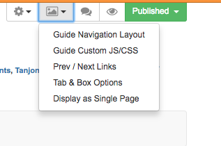
This is done by changing the “Guide Custom JS/CSS” which is found under the picture icon.

(note for beginners: I’ve placed the coding inbetween: /* text */ : so it doesn’t mess up my blog! you’ll need to remove that for it to work – i.e just copy from <style> to </style> if you want to include more than one element just include them all in-between the style and style elements)

How to make the font size bigger in your boxes:

Since some of my boxes do need text, I’ve made them 24 point so they’re easier to read for little ones.

Screen Shot 2017-12-05 at 04.54.38


/*

<style>

/* increases font size on box headers */
.s-lib-box .s-lib-box-title {font-size:24px;}


</style>

*/

How to make the font size bigger in your tabs:

Ditto for tabs – all these tabs are 18 point – also as good practise this forces you to keep the number of tabs under control and only on one line!

Screen Shot 2017-12-05 at 04.59.14


/*

<style>

/* increases font size on tabs*/
#s-lg-guide-tabs {font-size:18px; font-weight; normal;}

</style>

*/

How to make link description under link and bigger

These elements are all links (so I can get the stats), but I didn’t want the description to be tiny and at the side, and have a dot next to the image.

Screen Shot 2017-12-05 at 04.54.03

*/

<style>


/*link description center and bigger font*/
.s-lg-link-desc {font-size: 14px; font-weight: bold; text-align: center; display: block; margin-right: auto; margin-left: auto;}
.s-lg-tn {margin-left: 0px;}

</style>

*/

How to remove breadcrumbs

that’s all the stuff that makes your header look cluttered on the left you see the standard libguide with the blue breadcrumbs and all the tags etc, on the right the “clean” version with only the guide name and top banner:

*/

<style>

/* removes breadcrumbs */
#s-lib-bc{display: none;}

</style>

*/

That’s all I have time for now! Requests and questions welcome in the comments.

And please remember I didn’t invent any of this, most of it was the result of asking Springshare or in the lounge how to do something I envisaged. Their customer service and response is amazing.


How I built a libguide

aka I think I’d better think it out again …

Over the summer I completely rethought our school library libguides, and I’ve received quite a few positive comments and questions as to how I made the guides. Unfortunately there is not quick and easy answer, as the process resembles more closely this TED talk on building a toaster from scratch than a few lessons on embedding photos, files and links.  So a little warning that things may get a little geeky.

When I started building libguides at UWCSEA-East nearly 5 years ago, I really had very little idea what I was doing.  Content wise I was OK – I’d interview the teacher or head of department who wanted the guide, or Katie Day would tell me what she had in mind, and off I’d go finding interesting bits and bobs, do some extensive research and put them in a guide in some kind of logical flow and predictability.  We started with making IB subject guides, really something to help students think about and around their subject and to perhaps pique interest in an area for their Extended Essays. Then teachers would ask to expand on a specific area (like development economics).  Anyway, when I left to take up a position in a PYP library at CIS, I resurrected our libguides and continued in the same line with the thought of uniting our digital and physical resources. Except primary and secondary are two very different ballgames. Aside from the obvious content issues – videos and links need to be age appropriate, the way that younger students access web-based information is very different to older students.  And so my journey began.

During the LKSW at UWCSEA-East last February I attended a workshop by Brad Tyrell of Scotch College. Now Scotch probably has the most awesome looking libguides around.  They also have a team of developers and designers and IT-type specialists and vastly more staff than most libraries could dream of.  So let’s say they’re the Koenigsegg CCXR Trevita, and up to then I’d been the Tata Nano, I reckoned there had to be a way I could get to at least a Toyota level, or maybe a basic Tesla.

Unfortunately that workshop was a little too basic, but I did learn a few tips and tricks, including to watch out to use items that were counted statistically (books, links, databases) rather than just RTF and images, so you could have an idea of what people were finding useful / using and what not. There were also good hints on workflow and guide organisation.  After the workshop I jazzed up my homepage and it looked like this:

Old libguide

While it was colourful, and to my mind logical and easy to access all the bits and pieces (plus each box was a link rather than rtf, so I could track where users were going), the overwhelming response from students when I and teachers asked for feedback at the end of the term was that there were “too many words”.

This is a common refrain in schools about just about anything with words – from websites to encyclopaedias, to books and beyond. In fact my teenage son introduced me to the concept of TL.DR (too long, didn’t read) along with a chrome extension to take away the grief of wordiness.

Luckily it was just in time for summer break and I had plenty of time on my hands to dig into this.

As I’m no longer a child, and fully, if not hyper- literate,  I needed to understand a bit more about children and websites. There were more than enough articles on this, with this one from Canva the most useful. Conclusion after a few day’s reading was basically to go bright, use images and icons and moving and clickable things.

The next step was to brush up on some HTML and CSS. I’d previously run through some tutorials of W3Schools that were really good, and in fact used their scratch pads to do the limited coding I’d needed for the previous libguides. But I needed to think not just coding, but coding and kids. So I did a basic course for kids, kind of because I thought I’d need to think like a kid.  It actually was a brilliant way of seeing the relationship between HTML and CSS in a very tangible way.

Next up was looking through lots of Libguides. Luckily Springshare, the purveyor of Libguides is excellent at sharing information and customer service, as are most of the librarians who use Libguides – making their guides (most of the 550k) open to access and copy and use. They have a collection of their “Springypicks“. I saw one I rather liked, the Mary Baldwin university library, but couldn’t figure out what they were doing. So I reached out to their librarians, and Anya Jones was online at the time and wonderful enough to do a google video-chat with me, to point me in the right direction of the knowledge I was missing to go further. How important knowing what you don’t know can be!

So it was back to the learning site, and off to SpringyCamp. SpringyCamp is this awesome online learning platform provided by Springshare free of charge whereby at certain times you sign up for whatever course at whatever level you’re at and they show you how to do stuff. Since I was in Europe there was only a 6 hour time difference rather than they usual 12 hour night and day problem so I could attend one live. The best part is if things went too fast, or you’re in the wrong time-zone you can watch the videos afterwards. A tip in this regard – I usually watch the video on my iPad while “doing” the stuff on my laptop – this means I can pause, try out, rewind, retry etc. otherwise it’s in one ear and out the other by the time I try to implement anything.

Then I discovered how primitive and naive I’d been, and moved one step closer by downloading a web-text editor (in this case Atom) that made my life infinitely easier. (Ok, I was really starting from zero, so don’t laugh).  The most useful course I followed on the Springshare Video site was CMS Libguide / CSS.

Since it was vacation, I had the luxury of two teenagers at my disposal, and although they are way past primary age, they could critique what I was doing, and my daughter was put to work helping me select icons (mainly  flat iron and envato) to purchase, or to make icons by adapting graphics from noun-project (like the ones she made for the PYP site). This helped me through a short-cut not have to add yet another tool into my kit – learning adobe illustrator.

The last bit involved using LibraryThings for Libraries book display widget to have scrolling book covers. Luckily this was something I’ve used before, so it was just a case of uploading our most recent Marc records and creating separate widgets for new books (front page) and the various other pages and familiarising myself with their upgraded version.

Once you have all the tools and skills at hand, there is of course a fairly long process of trial and error and planning as to how to put it all together, some of that just plain old pen and paper. And even then you keep tweaking things as it doesn’t quite gel or look like you’d like it to.

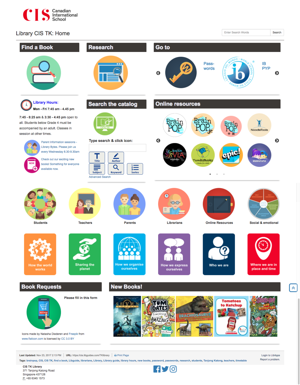
Here is the end result for the home page:

TK library front page


Of course changing one thing means you really need to change everything, because you’ve set new standards for the way things have to be.  This is time consuming, but you also have the advantage that it gives you lots of practise, so you don’t forget what you’ve just learnt. I also revamped all the UOI guides as they’re the most frequently used, and

G6 HTWW


I’m moving my way through other guides. And they’re not perfect, every time I look at one I need to change a bit more. As we move towards new unit’s I’m updating the old guides so that the look and feel is the same, that the same elements can be found in the same places, and responding to student and teacher feedback. Some guides are a lot longer with more information on them – depending mainly on how intensively they’re used by the teacher, and some are more perfunctory – basically just a minimal presence because they’re not used / valued as much. That’s fine by me.

When I tell people who ask that I do libguides inbetween everything else, often in 10 minute chunks of time it is completely true. I don’t have a lot of time for this, which is why I do set-up and brain work in vacation time, so during term time is just filling work.

The next phase of the process has been to do some staff development so that my staff can take over the maintenance of sites. For example every time we have a new batch of books, they scan the ISBN’s into the “new books” LTFL widget, delete the previous list and my front page is automatically updated. While I was waiting for a new Chinese assistant, I also roped a bunch of Chinese speaking mothers (see my point on 10% in my last blog – one of them has a degree in Chinese literature) to read through all my Chinese picture books and put them into resource lists based on the PYP essential elements. These could then be linked to the PYP guide.

As a school with bilingual classes we have an increased responsibility in the library to ensure there is equity in the provision of help and resources to our Chinese classes. This is easier said than done. My new Chinese speaking assistant has been tasked with a more extensive involvement, including creating the Chinese Guides, as that is not something my limited Chinese extends to. The great thing is that they actually love this work, finding it more creative and fun than the check-in/check-out and shelving tasks that is their usual daily fare. pyp concepts

The next next phase for me is student curation. We’ve done a little of that, for example by asking G6 students to recommend the 3 best sources of information during their exhibition project.   Last year we also started experimenting with Flipboard for the curation of articles by G5 & 6 students and teachers, and then embedding the Flipboard into the guide . We could do a lot more in that respect, but we’re being cautious with articles vetted by teachers or myself before being added.

Of course 4 months later I’m not entirely satisfied with everything. There is still a lot of work to be done on consistency and getting older guides up to standard. I need to work out a better process of guide building and handover. And after chatting to Kim Beeman at Tanglin, who is redoing her guides – albeit with a good number of dedicated qualified design and technical staff, I know I need to delve into UX.  She’s recommended a couple of web accessibility evaluation tools such as mouseflow, WAVE, and crazyegg. But that will have to wait for the Christmas break, as this is just a small part of my job!


No excuses: Syndetics

It must be an age thing – but as I’m getting further into my 50’s I’m becoming less tolerant of fancy sounding reasons and explanations that are actually just excuses for staving off change. This is the first of a series of posts on things that really annoy me as an international librarian, with a smattering of understanding of technology and a desire to serve ALL students, teachers, parents and administrators in my community as best I can. I have an overdeveloped sense of fairness and justice and I sometimes feel that librarians as a group are just too nice and suck up way too many things.

brazen

I’ll also admit to being emboldened by a FABULOUS new biography on women called “Brazen” (coming out in English next year – thank you Netgalley for the preview copy) You can preorder your copy now – suitable for High School 13+. And in fact this book just highlights what I’m going to write about today. This book originated in French. I’m currently totally inspired by the Guardian’s World library list and wanted to replicate it, adapted for primary school, particularly with a view to Uniting Nations day coming up in November.

bangladeshNow I work really hard at trying to transform my library into one that is representative of my students. I love the fact that my one Bangladeshi student asks me every week if I have any new books about or set in Bangladesh. And that at the beginning of term she came to proudly tell me that she was no longer the one and only but had been joined by another family. And when I showed her our new book about Bangladesh she took time out of her library browsing time to show me all the things the book depicted that were special to her.

I also work hard on my libguides to make sure that my books are showcased graphically and visually to make perusing them interesting for primary level students. So this is when I get really annoyed that Syndetics, the one interface for front covers that just about every system, from OPAC to libguides to LibraryThingsforLibraries uses does NOT seem to recognise that there is a publishing industry outside of the BANA (Britain, Australia, North America) countries – in fact they even struggle with Australia most the time. And don’t let me even consider China – well they cheat a bit – a lot actually – thinking that one ISBN number should suffice for a whole series of books – even if there are 57 books in the series.

This means that my libguide with my books from and about other countries, my catalog and my destiny discover new books respectively looks like this:


Spot the problem? And Syndetics actually prides itself in the fact that the covers of the coverless books are now colourful with title and author. NOT GOOD ENOUGH! For my catalog, my library assistants spend hours manually inserting the covers, and for the much touted, over promised under-delivered Destiny discover it’s just a blue boring nothing. So 5 of my 8 most recently purchased books are just blue blobs. So if you’re a librarian trying to diversify AND to make your new purchases appealing the cards are stacked against you.

Before I started writing this post I thought I’d do a bit of research into Syndetics, and the whole cover image thing. And then I thought no damnit. I won’t.  I don’t really care what the reason or excuse is. They’re selling an expensive service. They’re complicit in not improving the marketing of diversity of literature and I’m just going to put it out there and they can do the explaining, and hopefully a bit of soul searching on how they can make this better. What BIG things, what IMPORTANT and sea-change things they, as a big corporation as opposed to me as a little librarian in a little library serving 650 students from 40 nations can achieve.


Storage, seating and signage

I’ve been meaning to write this for the longest time – after the library renovation / redesign what is working and what isn’t. For the history have a look under make-over or library design posts and categories.

I was prompted to write this really due to three main questions that have been floating around the Facebook librarian groups that I’m a member of. The questions of storage, seating and signage.

Storage:

There was a question this morning about an administrator who expected the new school library to have no storage except a desk with two drawers …


Screen Shot 2017-08-12 at 4.00.04 PM

Now I’ve never seen this in a library, BUT when I went for a tour of the Lego regional hub in Singapore where each employee is give a 30cm2 cubby for all personal things and for the rest

IMG_3268

of the time they just hot-desk it. Any desk left unoccupied for more than 30 minutes gets its stuff removed! It did look very sleek, but sounded like something that would be pretty hard to adapt to.

I did try in our library to have the ability to hide the things that don’t need to be seen, while ensure that my staff and I still had a workable situation given the fact that a lot of what happens in libraries is about processing and storage!

First off the circulation desk. This is one of the prime examples of something that looks good but isn’t very functional. It’s a case where design won over best practice according to the literature and best instinct according to what was logical. But it looks nice. Says everyone who sees it.

It’s circular. It looks nice. But one of the first things they warn you against in library design 101 as it’s not very practical. And on the right side, instead of having the circle go to the wall I insisted out of health and safety concerns (we’re a primary library) that we could “get out” to attend to the “floor” very quickly. So it had to be open on both sides. So that means we lost about 50cm on the side. Which meant that the 3 chairs are pretty squishy next to each other. Which is good and bad – good because it means that it’s not really comfortable so you’re kind of forced to be up and moving and on the floor and doing people/book type things. Not so good because when 3 of you need to be there for a big class or year end check ins, there just is not enough space.

And the drawers. They don’t all open at once, so it’s a case of “you first, no you first” – luckily my ladies have a sense of humour and get on with each other.

We have some good processing space at the back, with a sliding surface that pops out to create extra space when you need it. That’s handy.

Cupboard storage

I had all those boxes of literature circle multiple copy books in my room and I didn’t want them in a space that students and teachers didn’t consider to be public. But we didn’t want boxes and boxes cluttering the space. some of the nicer spaces I saw had used sliding doors with writable surfaces in their classes or libraries, so we used that idea. The top and right photos is the storage with and without doors.  What you can’t see in the photo is that the projector screen comes down in front of the cupboards during presentations and the doors can be shifted to the sides for writing on while projecting. The bottom photo the sliding cabinets where all the PM readers are kept in a side class.

Good and bad of this – I love the fact that it looks so neat. But the doors have a habit of “jumping” their tracks and since the writeable surface is glass I’m nervous of kids opening it without an adult around. Also the glass surface can only be written on in black or dark blue – other colours don’t show up.

Seating

Way back in the day all I wanted was better seating where the chairs legs didn’t stick out with everyone tripping over them all the time (top left photo). Then I got a complete renovation and someone (not me) left the seating out of the budget. Then I got the budget and my seating! Yay!

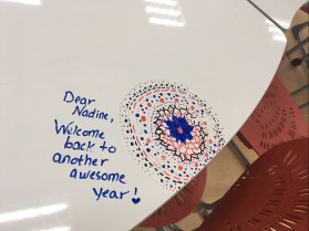
I must admit I really love my Furnware chairs and tables. My students love them too and my teachers are just a little big jealous of them – but they’re still sweet enough to leave me nice notes

img_5927.jpg

on the writeable surface! The chairs are quite heavy, but stackable and the “rocky” children love the fact that they can wiggle without falling over backward.

The beanbags are a mixed bag. Another no-no if you ask librarians, but on the balance I’d say I’m glad we have them. We have 12, and so far only one has had an issue with a zip, and that’s been repairable. My students were warned that if they “died” an unnatural death due to abuse they wouldn’t be replaced and they’ve been fairly good about policing each other about the usage. They’re super light and moveable, and it’s lovely to see how the students create their own spaces either sociable or isolated by the positioning of themselves relative to the bag and other bags and people.

We have 2 of the green armchairs, which are good for adult sized people and a couch in the classroom. Since it’s a primary school though – they also spend a lot of time sprawled out on the floor or on the mats. (Don’t you love the sense of humour – some of my kids left Bear reading a book after recess one day).

There is of course a lot of dragging bag back into place after recess ready for class, and I really need some kind of solution for my side classroom as it’s not ideal, but I need time to think about it and live in it more first.

Signage

We went with Merchandising Libraries for our signage and on a whole I’m quite pleased with how it turned out. We used their shelf-talkers, fiction section dividers and junior section dividers. We used plain black with white to go with our corporate look and feel. for the “inbetween” bits I use old VCR holders and print out the signage black background, white lettering. Cheap and good looking.

I had to order in a hurry to have it ready, and order everything at once and I only had the catalog rather than physical objects to go by.  This is what it looks like:

If I had to do it over, I’d stay with the Junior section dividers and the alphabet for my fiction sections but another solution for the picture books and junior section as the A-Z tends to stick out too much for little people with a poor sense of  proprioception. I also regret the fact that I don’t really have a good place to signal dewey. I’m still thinking about hanging something from the ceiling, but I hated that when I first arrived, so I’m going to have to think some more.

Part of signage is display space, and I’m really happy with that. The thin slats at the door and space above allow really flexible displays of books and student work.  And I love my pillar disguising round display space. Yes the variable signage above the slats could be better than just print outs on paper – ideas?

Next project – well, my children’s orthodontist had THIS in his surgery – talking to our open-minds coordinator about doing something similar when our G2’s have their plants unit …


Reduce, reuse, recycle and repurpose

One of the advantages of being on a tight budget with constraints, as I’ve written about before, is that it forces one into being thrifty and eco-conscious.  I just wanted to say a few words here about ways in which we managed to employ the 4R’s in our library renovation.

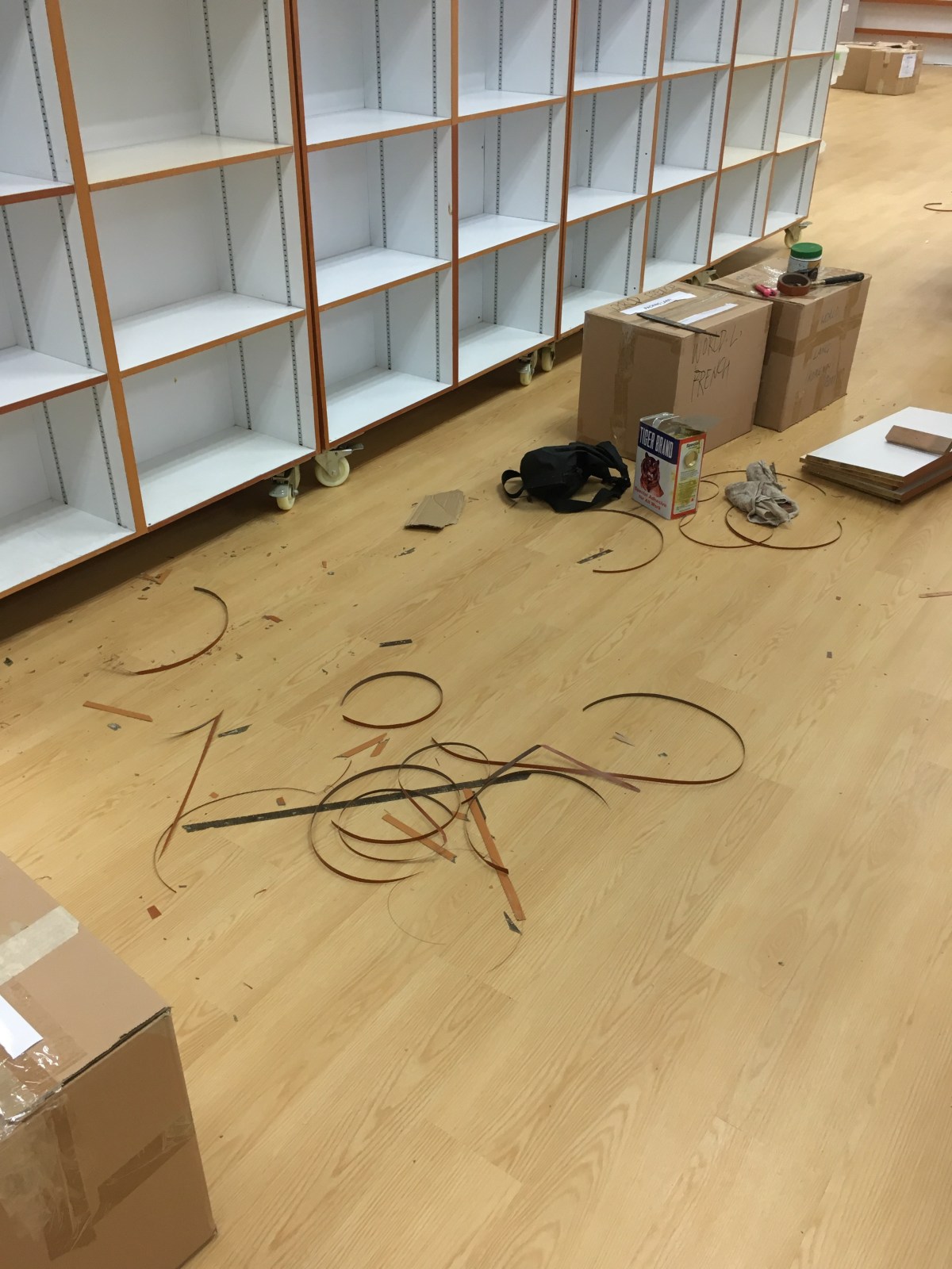
Library shelving is very very expensive. And there is a reason for this – it has to withstand a lot of wear and tear, be constantly shifted around and then

there is the question of load bearing (something our designers didn’t always take into account). Bottom line, we basically had to make do with most of the shelving we already had, and reuse it.  Not all of it was in great condition. So as part of the design brief we asked the contractor to refurbish the broken bits by re-lamination. Unfortunately this is not a very ‘sexy’ part of a renovation project, and we’re still chasing up on bits and pieces that need to be done! Most of it is looking pretty good though.

The green chairs were donated to us from our other campus, and the black shelving, and some other shelving that didn’t fit into the new design were donated by us to other classrooms and campus areas that needed it.

Other little things – our “fiction” etc. signs had a green border that looked out of place with the rebranding, so we just got some black electrical tape and taped over the green, so it looks black now. The non-glass doors got a new layer of paint, and larger glass pane windows.

The shelving above that used to hold picture books now is part of the junior section (I wanted more front facing space for our early chapter books to make them more enticing) so we inserted an extra shelf to each row to accommodate smaller books and the boxes in series.  One of our trolleys got donated to the IT department and the oldest saddest one got a new lick of paint in the same grey colour of our doors (part of the new branding) and looks just great now! The red plastic baskets found a new home in a classroom and was replaced by a wicker basket while we wait for the drop box to be completed. All our weeded books went to the PTA for their second-hand sale. And our old VCR boxes are still in use as alphabet markers in smaller collections – like Chinese fiction.

At the end of the day, besides the old tile carpeting in fact, very little ended up in the scrap heap. In fact many people when they come in have to ask what is actually new, because while everything looks new and different and lighter, they still recognise bits and pieces from the past.  I don’t think that’s a bad thing.


90% there …

Well we’re getting close to completion (all the yellow stickers are things the contractor needs to work on and the pink ones, things we need to do!) on our library project  (more links to the history here, here and here) and I’m feeling a little more relaxed. And even in the mood to discuss what has gone well (and what didn’t go so well / what I would have done differently will be the next post).

I’ve added 3 pano photos, from the front and back of the library and from our new “classroom” space.

img_4508
View from front

img_4509
View from back

img_4513
New Classroom

Let me start and devote this blog post with what I’m happy with – a comment from one of my Facebook groups prompted me to start with this, because I’m beginning to realise I’m way too much of a glass 1/2 empty kind of person, and if I have anything in the way of resolutions this year it is to be more positive! I’ll put some before / during and after shots in so you can see the difference!

I’m loving:

That I was fully part of the design process – in fact I was the designer and I only have myself (or maybe budget constraints or misinterpretations) to blame for what didn’t work out.  Plus my principal was immensely supportive all along the way, pretty much gave me free reign and was there when I needed her as a sounding board or to confirm a decision.

The wooden floors  

Oh I hated our old carpeting. Despite the fact that it was only about 2 years old it was pretty dirty and yucky – we get a lot of kids through the library each week and kids ain’t (and shouldn’t be) clean beasts. And because they were floor tiles, they could replace them, which meant colour differences, and that picky kid fingers could lift them up so they had to be re-glued regularly.

The extra display space

We librarians love to display and show case our collections. Whether it’s for a special event or to highlight new books, kindness week, a particular theme, whatever. I had no display space except for that which I’d artificially created by leaving shelves empty, and removing a computer from the dreaded pillar!  In the new configuration I’ve been able to convert the pillar to a wonderful wrap around display space.  I’ve also copied an idea from UWCSEA-East primary and added book ledges at the front door (they’re not perfect yet – too big and heavy on themselves but that’s another story).


Teaching spaces

I don’t have great pictures of before, or actually of after, so I’ll have to add these later. Basically my teaching space was a couch and a pulldown screen and a heavy very low flipboard I could drag out of my office when I needed to write anything, but couldn’t leave anywhere because there was no space for it!  Now there is not just one, but two teaching spaces as we knocked down the wall between the library and the staff room and the staff room was divided into a classroom and workroom.  Each has a projector with apple TV and each has a whiteboard space – the classroom a portable whiteboard and the main library will have two writeable glass sliding doors on either side of the projector screen on which to write. As a bonus, they’ve put blinds in front of all the windows that we can pull down so that the audience can also see what’s on the screen after 2pm!

Front Desk

I have very conscientious and neat staff, but open cupboards and a lack of space and no book drop meant that the front desk always looked messy even if it was actually pretty organised.  We went for a curved desk, for the show. I wasn’t 100% happy with that but it looks pretty good. I really like the design and the work surface (the top drawers are actually pull out work spaces) extra cupboard space and the fact that the cupboards have doors. I’ve very worried that the seating space is going to be very tight for three staff members, even if they’re all very petite. The compromise was I wanted the desk to be open on both sides because when (not if) there’s a “situation” on the library floor staff needs to be able to get to it very quickly.

White walls

Did I ever mention how much I hated the babypoop and maroon colour combination? Initially all I really really wanted was a paint-job and different seating furniture – but I got spoilt and got a whole new library!  Having white walls and light floor makes the whole space so much lighter – even though we’ve blocked off the windows on one side.

Collection flow

As the school has grown, so too had the collection. And choices I made last year on where to put what helped some parts of the collection (Fiction and Junior fiction) at a cost to others – nonfiction – where I split 000-399 and 400-999.  Now each part of my collection has it’s own section and I have an entire wall of nonfiction 000-999. It’s impressive even if I say so myself. And it’s “overzichtelijk” a wonderful word for which the English translation is apparently “clear” but what it really means is that you can take everything in in one glance.

There is also enough space on each shelf that books are not crammed together and we can put out front facing book(s) at the end.

I also ordered signage from Merchandising Libraries, both for A-Z for each fiction collection and with words and pictures for the nonfiction section and “shelf talkers” for various sections.

Another good thing is behind the teaching space / projector sliding doors we can now put in all the “kit” boxes – the multiple copies for literature circles and communal reading. Our school is in an old building so we don’t have grade pods or communal areas so all these books are stored in the library, and were stored in my office. I didn’t like this because it meant they were out of sight and mind of teachers and students and the door was a bit of a barrier (especially in the beginning when they didn’t know me) for them to come and browse the books. Now the office space can be used for sorting UOI books (so they won’t be on the floor in front of the main desk anymore), and the books will be easily accessed by everyone.

Teachers’ resources are also all together at adult height!

That’s all I have time for today. I’ll talk furniture and what could have gone better in the next post.