Storage, seating and signage

I’ve been meaning to write this for the longest time – after the library renovation / redesign what is working and what isn’t. For the history have a look under make-over or library design posts and categories.

I was prompted to write this really due to three main questions that have been floating around the Facebook librarian groups that I’m a member of. The questions of storage, seating and signage.

Storage:

There was a question this morning about an administrator who expected the new school library to have no storage except a desk with two drawers …


Screen Shot 2017-08-12 at 4.00.04 PM

Now I’ve never seen this in a library, BUT when I went for a tour of the Lego regional hub in Singapore where each employee is give a 30cm2 cubby for all personal things and for the rest

IMG_3268

of the time they just hot-desk it. Any desk left unoccupied for more than 30 minutes gets its stuff removed! It did look very sleek, but sounded like something that would be pretty hard to adapt to.

I did try in our library to have the ability to hide the things that don’t need to be seen, while ensure that my staff and I still had a workable situation given the fact that a lot of what happens in libraries is about processing and storage!

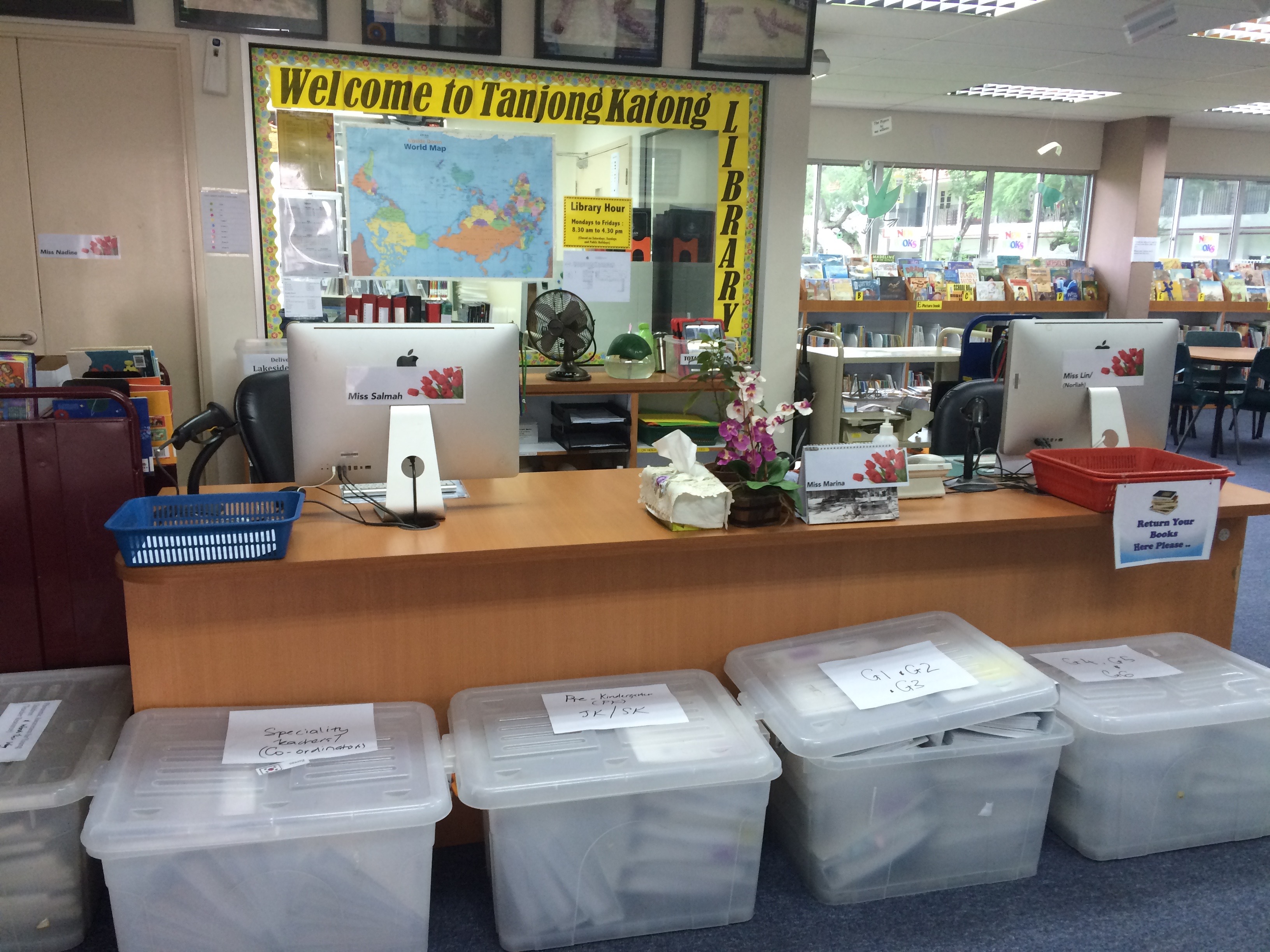
First off the circulation desk. This is one of the prime examples of something that looks good but isn’t very functional. It’s a case where design won over best practice according to the literature and best instinct according to what was logical. But it looks nice. Says everyone who sees it.

It’s circular. It looks nice. But one of the first things they warn you against in library design 101 as it’s not very practical. And on the right side, instead of having the circle go to the wall I insisted out of health and safety concerns (we’re a primary library) that we could “get out” to attend to the “floor” very quickly. So it had to be open on both sides. So that means we lost about 50cm on the side. Which meant that the 3 chairs are pretty squishy next to each other. Which is good and bad – good because it means that it’s not really comfortable so you’re kind of forced to be up and moving and on the floor and doing people/book type things. Not so good because when 3 of you need to be there for a big class or year end check ins, there just is not enough space.

And the drawers. They don’t all open at once, so it’s a case of “you first, no you first” – luckily my ladies have a sense of humour and get on with each other.

We have some good processing space at the back, with a sliding surface that pops out to create extra space when you need it. That’s handy.
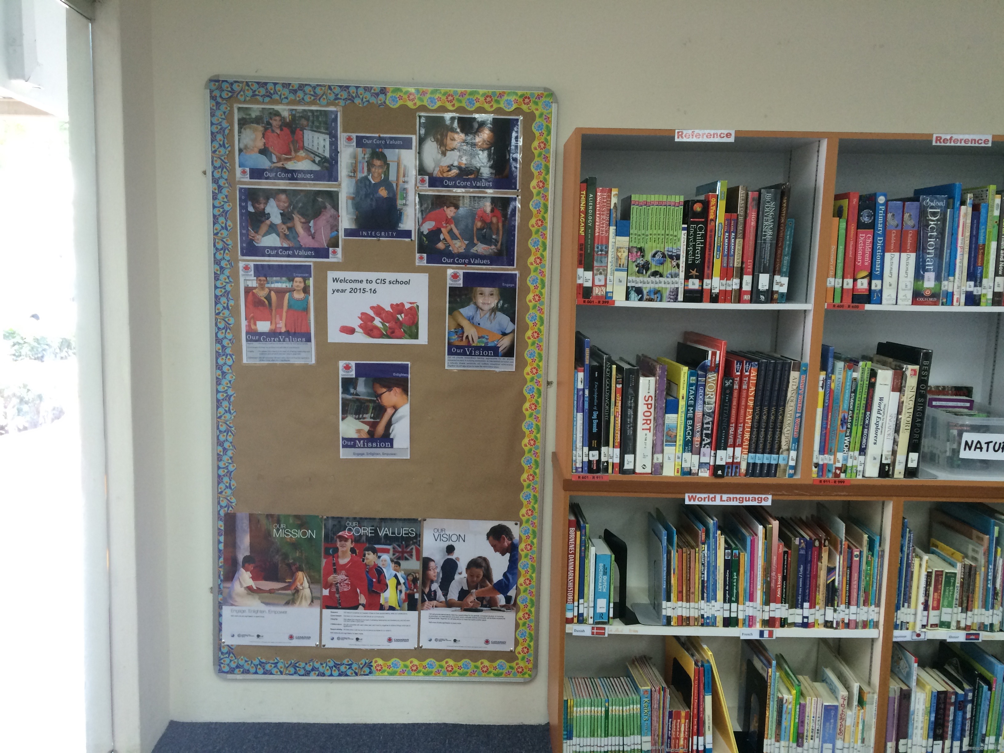
Cupboard storage

I had all those boxes of literature circle multiple copy books in my room and I didn’t want them in a space that students and teachers didn’t consider to be public. But we didn’t want boxes and boxes cluttering the space. some of the nicer spaces I saw had used sliding doors with writable surfaces in their classes or libraries, so we used that idea. The top and right photos is the storage with and without doors.  What you can’t see in the photo is that the projector screen comes down in front of the cupboards during presentations and the doors can be shifted to the sides for writing on while projecting. The bottom photo the sliding cabinets where all the PM readers are kept in a side class.

Good and bad of this – I love the fact that it looks so neat. But the doors have a habit of “jumping” their tracks and since the writeable surface is glass I’m nervous of kids opening it without an adult around. Also the glass surface can only be written on in black or dark blue – other colours don’t show up.
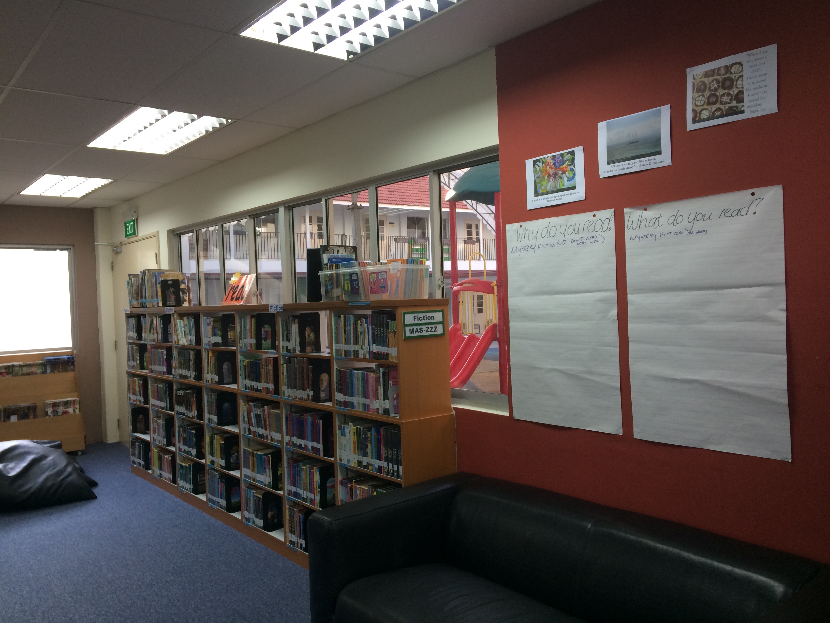
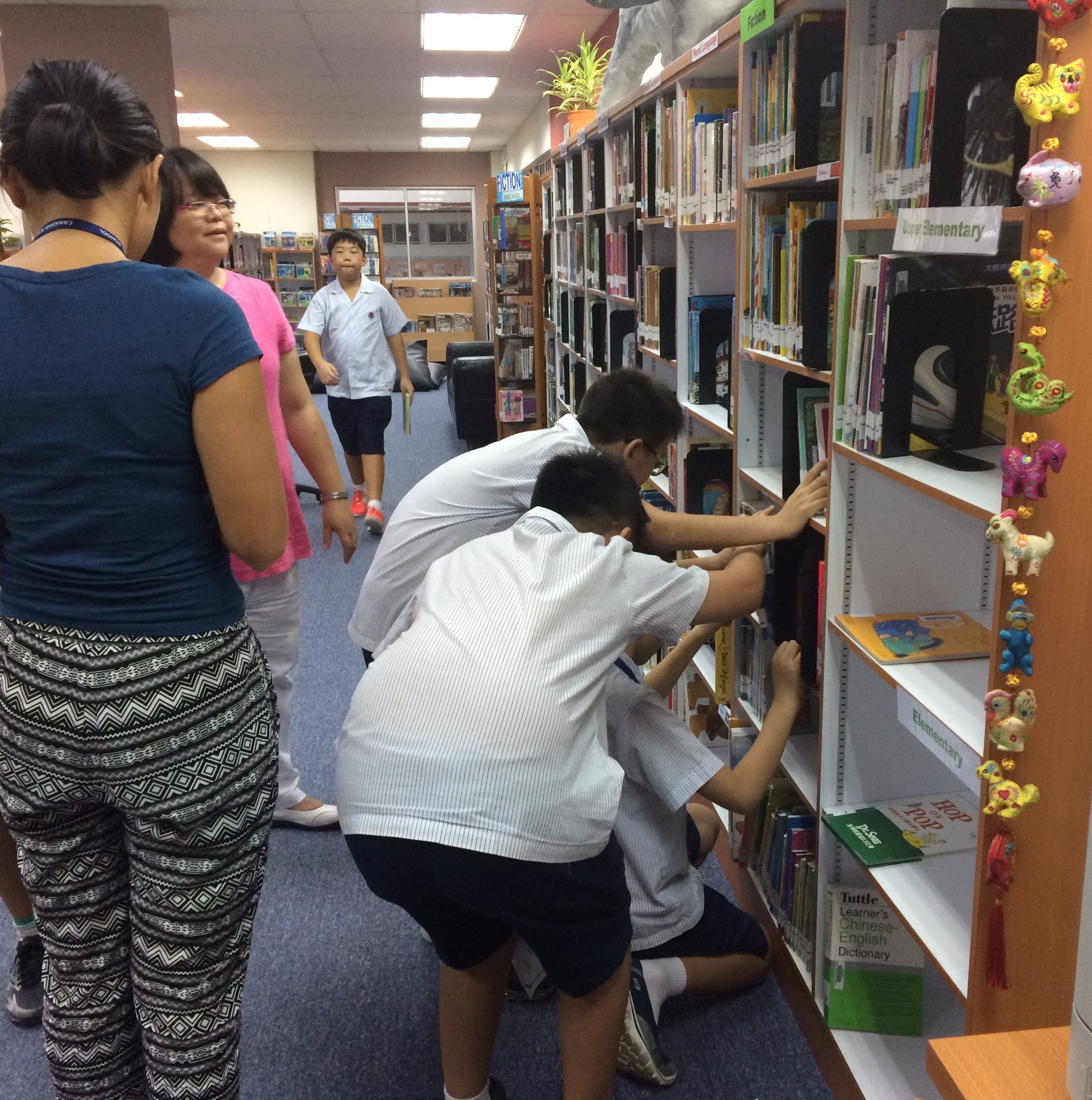
Seating

Way back in the day all I wanted was better seating where the chairs legs didn’t stick out with everyone tripping over them all the time (top left photo). Then I got a complete renovation and someone (not me) left the seating out of the budget. Then I got the budget and my seating! Yay!

I must admit I really love my Furnware chairs and tables. My students love them too and my teachers are just a little big jealous of them – but they’re still sweet enough to leave me nice notes

img_5927.jpg

on the writeable surface! The chairs are quite heavy, but stackable and the “rocky” children love the fact that they can wiggle without falling over backward.

The beanbags are a mixed bag. Another no-no if you ask librarians, but on the balance I’d say I’m glad we have them. We have 12, and so far only one has had an issue with a zip, and that’s been repairable. My students were warned that if they “died” an unnatural death due to abuse they wouldn’t be replaced and they’ve been fairly good about policing each other about the usage. They’re super light and moveable, and it’s lovely to see how the students create their own spaces either sociable or isolated by the positioning of themselves relative to the bag and other bags and people.

We have 2 of the green armchairs, which are good for adult sized people and a couch in the classroom. Since it’s a primary school though – they also spend a lot of time sprawled out on the floor or on the mats. (Don’t you love the sense of humour – some of my kids left Bear reading a book after recess one day).

There is of course a lot of dragging bag back into place after recess ready for class, and I really need some kind of solution for my side classroom as it’s not ideal, but I need time to think about it and live in it more first.
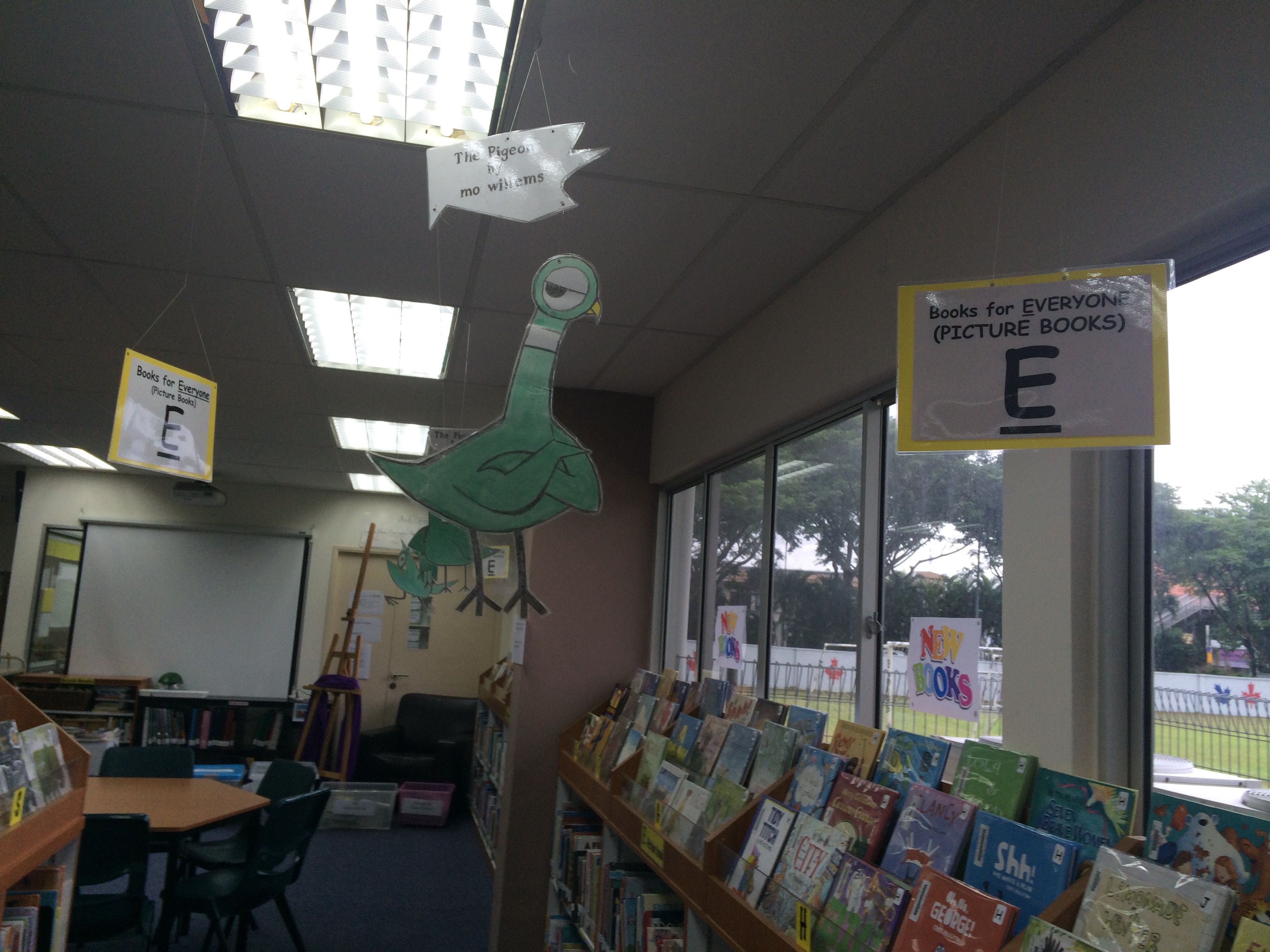
Signage

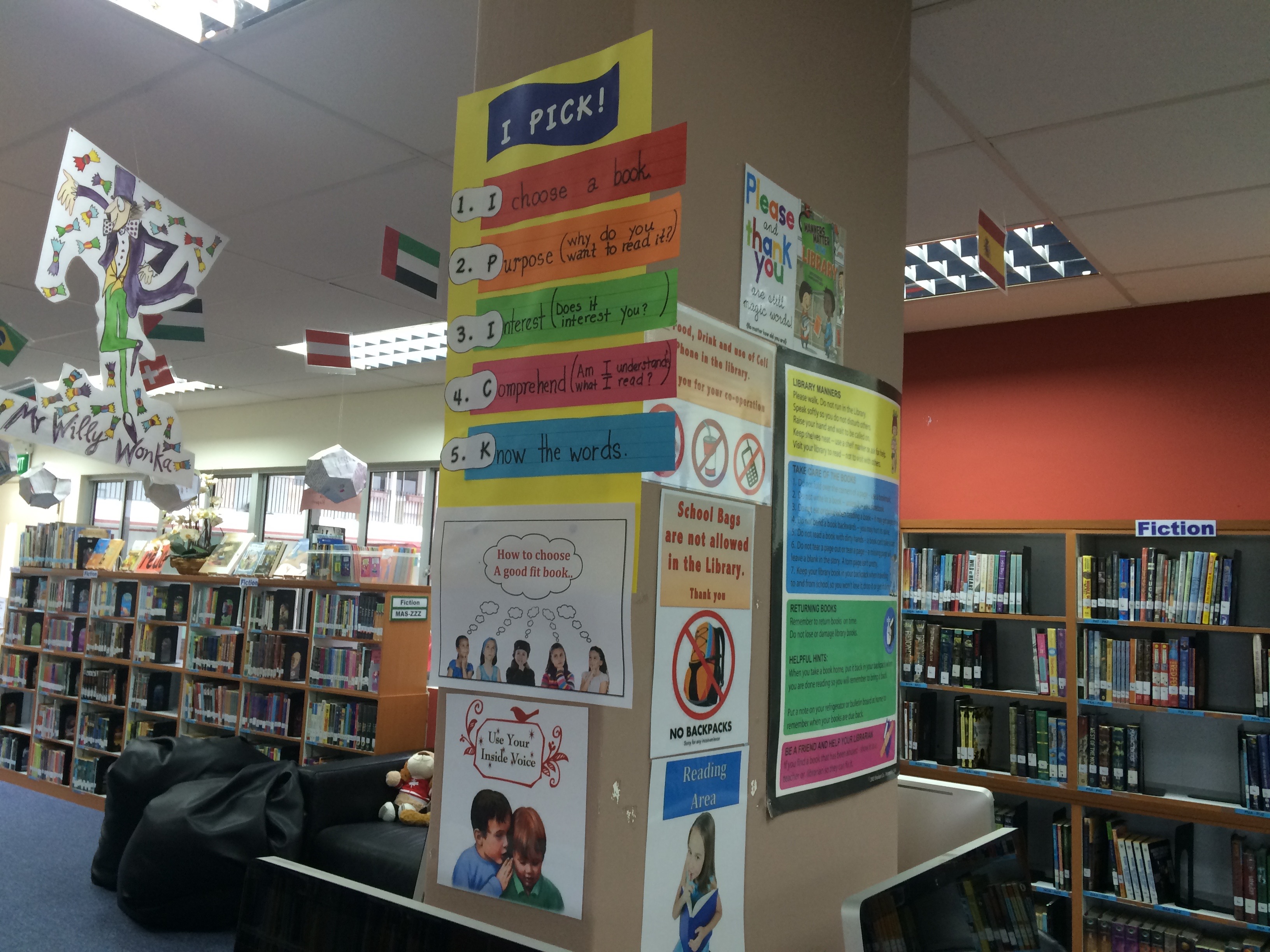
We went with Merchandising Libraries for our signage and on a whole I’m quite pleased with how it turned out. We used their shelf-talkers, fiction section dividers and junior section dividers. We used plain black with white to go with our corporate look and feel. for the “inbetween” bits I use old VCR holders and print out the signage black background, white lettering. Cheap and good looking.

I had to order in a hurry to have it ready, and order everything at once and I only had the catalog rather than physical objects to go by.  This is what it looks like:

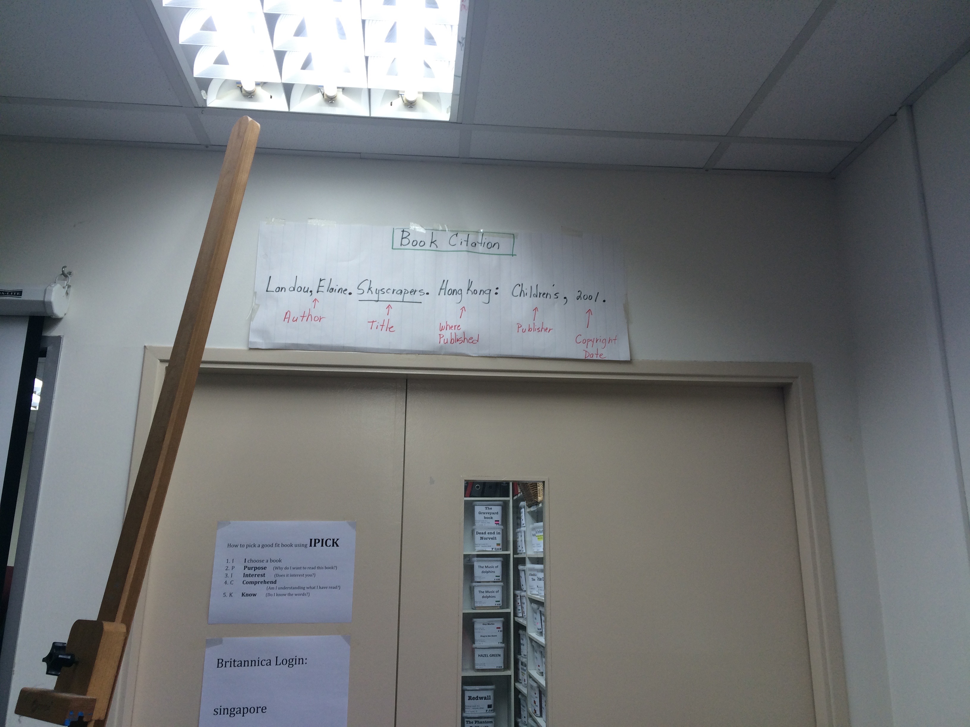
If I had to do it over, I’d stay with the Junior section dividers and the alphabet for my fiction sections but another solution for the picture books and junior section as the A-Z tends to stick out too much for little people with a poor sense of  proprioception. I also regret the fact that I don’t really have a good place to signal dewey. I’m still thinking about hanging something from the ceiling, but I hated that when I first arrived, so I’m going to have to think some more.

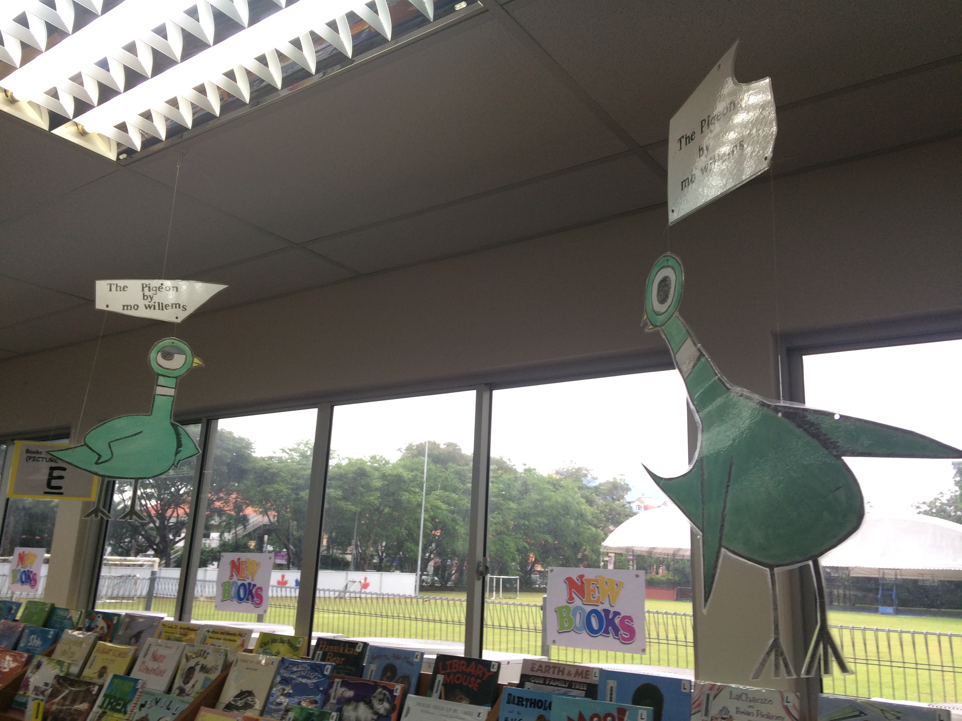
Part of signage is display space, and I’m really happy with that. The thin slats at the door and space above allow really flexible displays of books and student work.  And I love my pillar disguising round display space. Yes the variable signage above the slats could be better than just print outs on paper – ideas?

Next project – well, my children’s orthodontist had THIS in his surgery – talking to our open-minds coordinator about doing something similar when our G2’s have their plants unit …


Design – space, thinking and time (1)

Time to make a quick reflection of the last 3 weeks before I forget it all in the blur of activity of the coming weeks.  When I started my job I inherited a library that is not very large, serves around 650 elementary school students ranging from Kindergarten (age 3) to Grade 6 (age 11/12).  The space is notionally flexible, in that the central bookcases are on wheels, but practically inflexible. As Woolner (2010) points out – flexibility in furnishing a learning space can be hampered by how easily and quickly furniture can be moved, the amount of space available to reconfigure furniture and who has ownership of the space.

Before I proceed, I do want to say quite explicitly that this is in no way a criticism of my predecessors who were wonderful people, great professionals who did good work and much loved by the entire community. If anything they suffered mainly from lack of time due to fixed scheduling which didn’t allow thinking time nor time to work on some of the things I’m mentioning below. The library also has a very very small budget and the school will be moving premises in the next two years so investment in space has ceased. I also have the enormous benefit of doing a course like INF536 which allows me to learn about and consider the impact of design and design thinking on learning and which also forces me to undertake tasks and assignments that I may not otherwise free up time to do.

As Yvonne Barrett discussed in her blogpost, before embarking on this course the first inclination one would have would be to start moving things around and try to make it all different. Instead, following our observation tasks, we met together and looked at the space and just philosophised about what would be possible and how the space was used. Instead, each day I make a few small changes based on observations of the previous day. Except as far as the signage and fake flowers were concerned.


Now, when one enters a space like a library, even if one ostensibly “owns” that space, there are some considerations of co-users that I think it’s important to bear in mind. The first week I was getting to know one of my library assistants, the second week she was joined by our permanent part time assistant and last week the second full time library assistant came back to work. These ladies have a wealth of knowledge about the library, how it functions, the teachers, the students, the families. I also wasn’t sure who was responsible for the fake flowers and signs, so I kind of tiptoed around the topic and then finally asked if anyone would feel insulted if I removed all the dangling things from the ceiling, the “no” signs from the walls and replaced the fake flowers with live plants. To my immense relief they all unanimously agreed and down came all the distracting bits.


Decor

IMG_0553
Dusty fake orchids

IMG_0586
Real plants and a shark made by students last year kindly on loan from the art department


Signage:

It was the signage that disturbed me most of all, a mixture of handwritten, printed out pictures, a lot of prohibitions. But who “owned them” and who may be upset if I took them down?

Handwritten signs high up and not very clear
Before: Handwritten signs high up and not very clear

Lots of prohibitions
Before: Lots of prohibitions

Images magnified by pixilated - kids always notice this!
Before: Images magnified but pixilated – kids always notice this!

"New Books" signs on every window - but the books were definitely not new - kids aren't stupid
Before: “New Books” signs on every window – but the books were definitely not new – kids aren’t stupid

IMG_0483
Before: Lots of things dangling from the ceiling

Inbetween: oh dear, blue tack makes a huge mess - we need maintenance to pay a visit
Inbetween: oh dear, blue tack makes a huge mess – we need maintenance to pay a visit

No more dangling bits. Moved small tables to in front of bookshelves for book display
After: No more dangling bits. Moved small tables to in front of bookshelves for book display. “New Books” sign removed from all windows, pillars repainted and empty

Added a few inspirational quotes on the wall and blank posters for students to write on - "why I read" and "what I read"
After: Added a few inspirational quotes on the wall and blank posters for students to write on – “why I read” and “what I read”

Working space / visibility

My office was (and still is to a certain extent) a mess. My view out, and by default other’s view in to me was blocked on both sides by a projector screen and signage of the front desk.  I decided to pick my battles, since I didn’t want to spend the year trying to train everyone to put the screen back up every-time they’d used it, so I politely asked my staff if they’ mind relocating some of the signs on their window to open things up a bit – luckily they were very accommodating and did so. I’ve put in a requisition for a white board to cover the other window.

IMG_0464
One window blocked by projector screen on the other-side and filing cabinet

I realised I shouldn't try to retrain everyone to put the screen back up again ...
I realised I shouldn’t try to retrain everyone to put the screen back up again …
IMG_0465
Other window blocked by signage at front desk – I feel like I’m in a dungeon


IMG_0466
Nice sign, and great map of the upside-down world but I asked if they’d mind moving them so I had more visibility

Display / Shelving

We have a relatively small space and A LOT of books. At the moment everything is looking particularly crammed as circulation is not yet in full swing.  Once we’ve cut down the books by a couple of 1000 in circulation I want to start decluttering the shelves. In the mean time, I’ve relocated the DVD collection into my office as only teachers were permitted to borrow them anyway, and moved the World languages into a more prominent space, moved the reference books down and created 6 shelves for display.

I’m planning to make it a UOI (unit of inquiry) visible learning space just as soon as kids start producing things in their classrooms.  For now we just have a few pictures and books on “Friendship” to start the year off on a good note.

Since I’ve been discussing book-care (with the little ones) and essential agreements in the library (see this great article) with the older students, I’d like to “borrow” and adapt the great signage I saw that Barb Reid had put outside the UWCSEA-East Primary library (see picture below).

Display board at entrance that never changes and shelf with: Reference books, Teacher Books; World languages stuck at bottom

Before: Other half of shelf. Poor World Languages and I’m wondering if teacher books can go to staff room and I empower them to do self checkout???

After: Live plants, 6 top shelves for display, world languages moved teacher's books still there, but I have a plan to reclaim the whole area for display
After: Live plants, 6 top shelves for display, world languages moved teacher’s books still there, but I have a plan to reclaim the whole area for display

Signage seen at UWCSEA-East primary library - I'm going to ask permission to repurpose and adapt this to our library
Signage seen at UWCSEA-East primary library – I’m going to ask permission to repurpose and adapt this to our library


The carpet/rug/mat

The carpet is missing

There is no picture of the carpet / rug / mat because the carpet disappeared over the summer – which made for great speculative discussion with each class about writing something about the “mystery of the missing library carpet” and we talked about how the shark may have eaten it, or if the previous librarian had used it as a magic carpet to fly back home.  But 35 classes have reminded me that the carpet looms large in their lives and we need a carpet in the library!

To do list:

  • My STEAM colleague has offered to get the kids to help me make some nice signs for areas of the collection that are a bit more natural.
  • My Chinese colleagues are going to help to ensure that our Chinese collection is levelled and that our signs are in Chinese (duh!)
  • Need to free up more display space – I’m considering putting the professional books into the staff room and training teachers to do self-checkout using the Follett mobile app.
  • My workspace is still terribly cluttered. Want to put up a whiteboard over the window that is always blocked by the projector screen and to reorganise the book boxes to free up some shelf space.
  • We need to tweak the schedule a bit more. I’ve been reading some great literature on fixed vs. flexible scheduling – we’ve moved from fixed scheduling to hybrid scheduling and I’ve just sent out a google form to everyone for comments and feedback.
  • Digital Visibility – although we’re subscribed to libguides, no-one has had time to populate any (hangover from fixed scheduling). Since my Grade 5 class has a very limited number of physical books for their current unit (“how we organise ourselves – YAY on design thinking!!) I’ve offered to help make a digital guide on this – which is probably more relevant.
  • Aligned to that, we have a long a complicated URL for our catalog, a very cluttered landing page and no nice website – Katie Day (Librarian Edge) pointed me to a great article by Aaron Tay about how libguides can help me fix that!
  • Library / librarian visibility – I created a “who I am” little poster, but then it got stuck while I wait to hear about the social media policy of the school (it has my twitter address etc. on it!). Besides that I need to invite myself to some planning meetings and make sure I understand what each teacher is looking for, and also sell what they don’t know they need.

We've added a lot of chinese books this year and space in the calendar for chinese reading and borrowing
We’ve added a lot of chinese books this year and space in the calendar for chinese reading and borrowing

Library Home screen - not very user friendly
Library Home screen – not very user friendly

Cluttered shelves
Cluttered shelves

Flyer for teachers - not yet deployed
Flyer for teachers – not yet deployed

I’m going to talk more about the “design thinking” and “design time” in the next post.

References:

Woolner, P. (2010). Rebuilding your school: can we transform learning through space and facilities? In The design of learning spaces (pp. 80–94). New York: Continuum International Pub. Group.