Libguides – not so easy (2)

The basic page view of libguides is the option of a top and bottom row of one column, sandwiching a number of rows of either 1, 2, 3 or 4 columns. But the constraint is that then all the boxes in subsequent rows need to be in the chosen number of columns.  And sometimes – particularly for front pages / landing pages you’d like a variety of rows / columns.

So today a little bit about how to get from an idea to the actual guide with extra rows and up to six columns.

In the sketch above you can see what I’ve called “student template” On my home page I have an icon called “students” and I wanted a secondary launch page where my students could find everything they needed on one page. It’s probably a little too busy, and I’d perhaps eliminate the second row of many icons – the “go to” one in retrospect. Anyway how to do it.

Unlike in the previous post, where adjustments to a guide were made in the “Guide Custom JS / CSS” these changes are “programmed” into the guide template at the “look and feel” level.

Admin – Look and Feel – Page Layout

Screen Shot 2017-12-12 at 04.15.25

Here you can either choose a template that you’ve created, or create or edit a template. You can see the last one is called “Students Homepage Template”

The main thing in this somewhat scary process of rewiring a page is to make sure you create a plan before you start – which is why I put the plan and actual side by side.

Again, as stated in “how I built a libguide” you will need to have a web-text editor, (like Atom) so that you can try and mess up and try again without impacting your users.

I don’t have time to write about everything, so I’ll just explain the basics and then give you the bits of code to make the 5 different rows.

Overview

The libguide page is divided into 12. I think having 12 columns would be eye-boggling and since I have 6 Units of Inquiry and 6 grades, the maximum number of columns I needed was 6.  So the size of 6 columns is 2 each, of 4 columns is 3 each etc.

A few other considerations are seeing the guide on the iPad (default for my students) or phone (default for the parents). I won’t claim to have gotten that part correct, or even to understand it entirely – you’ll need to get more expert for that, but I’ve put in a best effort. My guides are best on the desktop, followed by iPad in landscape mode.

Planning

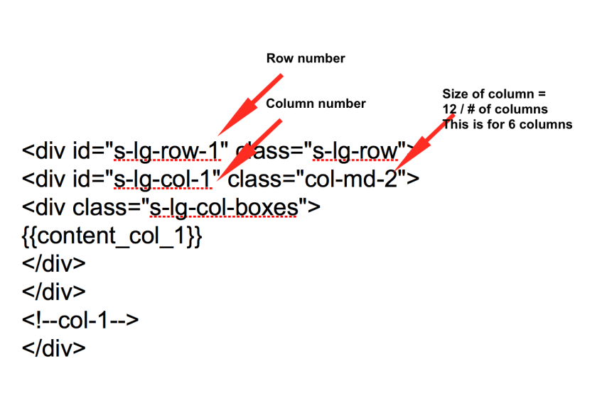
Sketch out what you want your page to look like and number the rows, and then number each column. You can see I actually have 5 rows and 19 columns. It is necessary to be able to keep track of things, as row, and each column in that row needs its own little bit of code.

This is the basic coding:

Screen Shot 2017-12-12 at 08.41.16

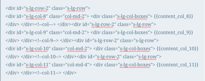
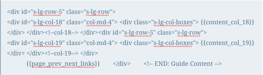
And here it is row by row. My apologies – I wanted it to be easy to copy and paste and originally had it in quote boxes, but WordPress does NOT like you putting bits of code into your posts, so in the end I had to screen shot the relevant bits. And I see I’ve mixed up bits of row 2 in row 1. But I’m sure you’ll get the idea.

Row 1

Screen Shot 2017-12-12 at 08.44.09

Row 2

Screen Shot 2017-12-12 at 08.44.00

Row 3

Screen Shot 2017-12-12 at 08.43.54

Row 4

Screen Shot 2017-12-12 at 08.43.47

Row 5

Screen Shot 2017-12-12 at 08.43.34

Once you’ve changed the template and uploaded it into your look and feel, you now need to apply it to your guide.

Once again this is done under the “picture” icon on the top right hand side, and this time you choose “guide navigation layout” and from the drop down box choose the template you created.

I’ve shared this template with the community, so you should be able to get the whole template and use and adjust as you want.

Screen Shot 2017-12-12 at 04.57.52

WARNING

Please do this all in a test environment with guides that are not live. Things can and do go horribly wrong and I’ve had to be “rescued” on a number of occasions by Springshare due to faulty code wiping out my ability to do anything!

Libguides: a couple of easy things (1)

Well, the response to my last post was quite surprising. So I’ll continue with a few posts on very easy things to change the look and feel of your guide.

First off though, please do consider joining the Springshare lounge – help is literally there for the asking, and no question is too basic.  You join a group based on your usage.

Secondly in response to what we use: Libguides CMS V2. If you’re on V1 still, update (free) to V2 as it offers so much more. We also have a paid subscription to LTFL (library things for libraries), we’ve just subscribed to their book display widget,  it’s an extra cost, but it’s for our 3 libraries at what I consider a reasonable cost, and they’re very generous on their trial period. Cost depends on how many of their services you use. If I had more budget I’d subscribe to their series and tagging services as well.

Finally – if you’re looking for non-video guidance on libguides, I’ve found the University Libguides to be the best, (Kent for HTML/CSS, Illinois for getting startedNorthwestern, Calgary, etc. )as they’re the most extensive and intensive users of Libguides, but I’d like to also give a shout out to RILINK schools, as their guide is also very comprehensive.

OK finally, a few easy things

Changing font size just for one guide:

Screen Shot 2017-12-05 at 04.40.41

This is done by changing the “Guide Custom JS/CSS” which is found under the picture icon.

(note for beginners: I’ve placed the coding inbetween: /* text */ : so it doesn’t mess up my blog! you’ll need to remove that for it to work – i.e just copy from <style> to </style> if you want to include more than one element just include them all in-between the style and style elements)

How to make the font size bigger in your boxes:

Since some of my boxes do need text, I’ve made them 24 point so they’re easier to read for little ones.

Screen Shot 2017-12-05 at 04.54.38


/*

<style>

/* increases font size on box headers */
.s-lib-box .s-lib-box-title {font-size:24px;}


</style>

*/

How to make the font size bigger in your tabs:

Ditto for tabs – all these tabs are 18 point – also as good practise this forces you to keep the number of tabs under control and only on one line!

Screen Shot 2017-12-05 at 04.59.14


/*

<style>

/* increases font size on tabs*/
#s-lg-guide-tabs {font-size:18px; font-weight; normal;}

</style>

*/

How to make link description under link and bigger

These elements are all links (so I can get the stats), but I didn’t want the description to be tiny and at the side, and have a dot next to the image.

Screen Shot 2017-12-05 at 04.54.03

*/

<style>


/*link description center and bigger font*/
.s-lg-link-desc {font-size: 14px; font-weight: bold; text-align: center; display: block; margin-right: auto; margin-left: auto;}
.s-lg-tn {margin-left: 0px;}

</style>

*/

How to remove breadcrumbs

that’s all the stuff that makes your header look cluttered on the left you see the standard libguide with the blue breadcrumbs and all the tags etc, on the right the “clean” version with only the guide name and top banner:

*/

<style>

/* removes breadcrumbs */
#s-lib-bc{display: none;}

</style>

*/

That’s all I have time for now! Requests and questions welcome in the comments.

And please remember I didn’t invent any of this, most of it was the result of asking Springshare or in the lounge how to do something I envisaged. Their customer service and response is amazing.